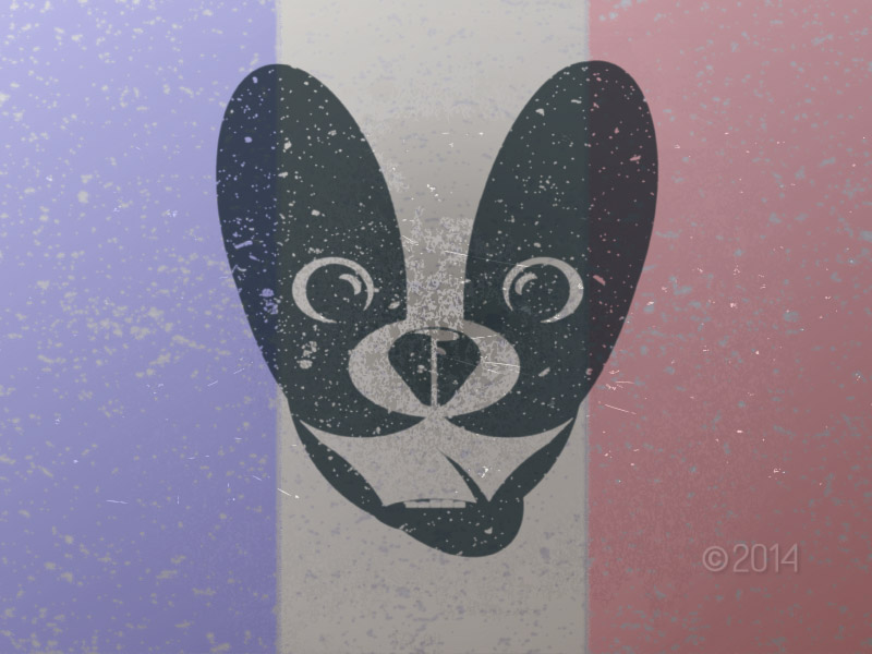
Sticking with the distressed look, I increased the size of the main logo and background. I decreased opacity on the background and added drop shadow to give greater depth to the worn concrete effect. This continues to be a fun side project, while I think a simplified overall concept will provide the best end result. More ideas to come!