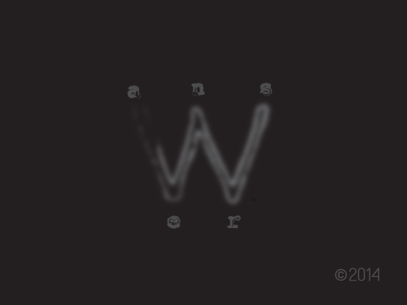
This logo is an early draft for an urban clothing and accessories company.
The font was chosen as a contrast to the central “W” to reflect layers of paint with years of erosion, which present a stylistic mix found in a city.
Choosing the “W” as the central character was dangerous since it is not a dominant vowel sound in “answer” — but the structure of the W immediately caught my eye as a platform to support the other letters in the logo, like a five-pointed guide.
Reducing the sharpness of the W allowed the other letters more presence in the logo, while retaining the natural flow provided by the W shape.

